Text via The Things
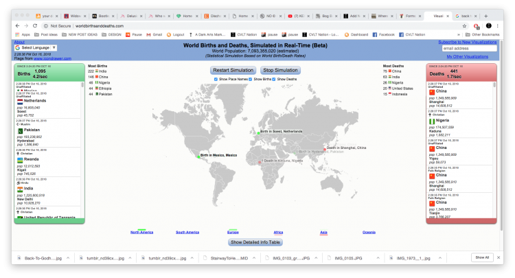
This website logs the world’s births and deaths in real time. Flashing green dots appear on a simple map, indicating where a baby was born. (There is also a continuously-updating list on the left for births). At the same time, flashing red dots appear on the map, indicating a person who has died (on the right is a list of all the deaths). It even tells you the religion of each new and dead person. It’s pretty surreal to see just how many people are coming into this world at every moment, just as others are exiting it. The dots are flashing every damn second.
You can pull up a detailed table and see just what the birth/death rates are for each country. According to the charts, India has the most births, while China has the most deaths. There seems to be more babies being born than people dying, which, for me, makes it less morbid.